Templates
Introduction
This set of templates was selected according to what’s been observed amongst practitioners of the Add-in. It is an ongoing work of analysis and upgrades, the goal being to remain flexible and propose an efficient use of our Add-in.
For most of the templates, the main inputs are to be inserted in the “Inputs” tab. Yet for some data like countries, asset types and industries (both present in the “Granular View” tab) you can add your own lists. By default, a function is put in place but you can simply override it with your content if it is more precise. In the “Aggregate View” tab, you can choose the stress scenarios and stress drivers you want to apply the shock on. You can also insert your shock magnitude in the “Stress on Demand” section.
Access to the templates
Template guide
To get a first glance and understanding of our templates, you might to take a look at our template guide. The comments and framework are general to all templates and should help you view the right way the EL templates.
Categories
For each of the templates, we recommend that you insert the assets’ identifier. Also, in the side panel templates (accessible via the “Library”), make sure to read the description post and “INPUTS” list.
Cross-assets analytics
- Portfolio simulation - Global template with quantities
- Portfolio simulation - Global template with quantities and rebalancing
- Portfolio simulation - Global template with weights
- Portfolio simulation - Global template with weights and rebalancing
- Portfolio simulation - current
Model portfolio analytics
Fixed income analytics
Alternatives analytics
Limits
Range
The templates contain limits. Some of them are easily broken. For example, the number of positions is limited to 300. All the formulas’ ranges accept 300 cells. Yet, in the ribbon, by clicking in “Formulas”-> “Name Manager”, you will retrieve all the names attributed to the columns and cells of the templates. The references can be altered at any time. They are several dependencies, make sure that your modifications are consistent with the rest of the references.
Non dynamic graphs
Other limits reside in the dynamism of the spreadsheet. By default, Excel allows little dynamic behavior. For instance, in the tab “Aggregate View”, the stress events’ charts are to be viewed only if measures are expressed in “Relative”. Indeed, when switching to “Absolute”, the axis does not automatically change its bounds. The parameter is named “Measure Type” and is present in the “Granular View” tab.
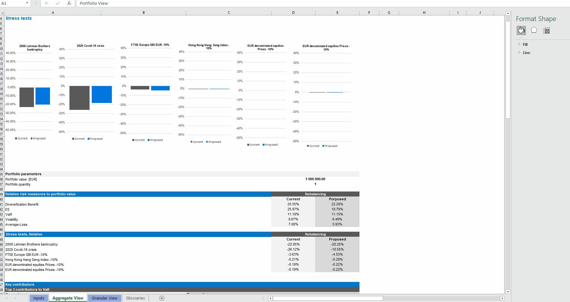
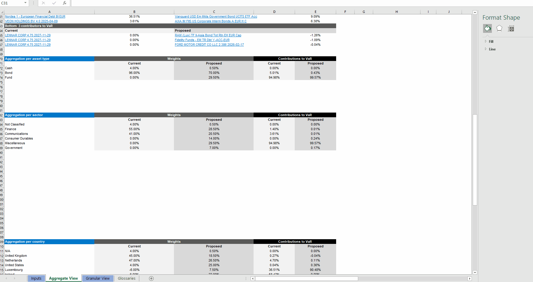
Aggregation tables
Another example, are the extra rows between the “Aggregate by …” tables (“Aggregate View” tab). These rows act as a buffer so that the table can expand in case positions present a greater diversity. Ideally, these rows should not appear if the spill does not occur. Conversely, they should automatically get inserted and contain the result of the spill.
Dealing with #VALUE!
Because the templates hold a lot of dependencies, having #VALUE! will most certainly jeopardize the overall analysis. The most common case is probably that you enter all the data in the “Inputs” tab, go to the “Aggregate View” tab and realize that no computations could be performed at all. Investigating a bit further by going to the “Granular View” tab may bring some answers. It is certainly the case that one or several positions could not produce healthy results due to their status being not “ok”. To find out about their status, check in the universe portal. It is possible that the asset is either “missing data” or “not found”/”not priced”. The former case should not present so much of a problem and is often quickly resolved by our data quality team after having sent a support ticket (the link to the portal is available via the “About” button). The latter is more complex though. While a support ticket will increase the investigation and reactivity on our side, the short-term solution is to use a proxy. To correctly parameterize asset proxy, visit our dedicated documentation on this link. In other cases, when possible, The troubleshooting section of the website documentation should help resolve the issue.